“To me, an urban explorer is anyone who has a thirst for curiosity. Through their curiosity, they seek new ways of doing things and are not afraid to explore unchartered territory. Being an urban explorer is about challenging yourself physically and mentally, taking yourself to that next level. Applying it to myself and the world of design, it is about being my own worst critic. Exploring new avenues, inspirations and skills will only push me further on the path of growth that opens up my mind to new ways of designing.”
Elaine Fok
Creative Director and Partner at Spectra Partnership
Our Urban Explorer
Could you please introduce yourself to our guests?
My name is Elaine and I am the Creative Director and Partner at Spectra Partnership, a boutique branding and innovation design firm based in Hong Kong. I have been doing branding for quite some time so I have built up a portfolio of experience in this area of expertise.
Did you always know you wanted to be in the realm of design?
This traces back all the way to my goal of wanting to be an architect. Growing up between Toronto and Hong Kong, surrounded by all the pristine skyscrapers around me, I was fascinated by the shapes, lines and facades of the different buildings. Near the end of middle school, I wanted to go into Architecture but the school I wanted to apply to at the time required me to have a Chemistry credit which I did not have. My goal at the time was to get into York University in Toronto, Canada and so I told myself that if I did not get into this school, I am not going anywhere else. Naturally, I found my way into the world of design and have never looked back since.
There are so many different areas of design, from industrial and interior to fashion and graphic. What do you love most about graphic design?
Honestly, I did not know much about graphic design until I got into University, which was where my skills and experience in this area started to develop. I take great pleasure in putting my ideas onto a flat surface rather than 3D design. What I enjoy most about design is looking at the façade and process, the “blueprint”, that essentially boils down to paper and pen. For myself, I take inspiration from all types of design, from industrial to product design, but I would say that fashion is furthest from the spectrum for me.
How do you think exploring the city makes you a better designer?
For people in this industry, I think it is important to constantly be curious and be fascinated by the world around you. By absorbing new experiences through observation and trying new things, we continuously challenge ourselves which improves in our design as well. Traveling is one of the core ways to draw inspiration which can then be injected into the design philosophy. In my opinion, I think every person, whether in creative industry or not, should go explore.
Do you ever get designer’s block, and if so, what do you do to overcome it?
Strangely, there are actually two outlets I tend to indulge in when I find myself stuck creatively. The first one is hitting the gym and allowing myself to take an hour of rest and clear my head. I remember an instance where I had designer’s block so I went for a run on the treadmill facing a window that overlooked the city’s vast skyscrapers. I recall drawing inspiration from this immaculate view and using the grid of the building to create an identity for a design. The other option is reading magazines like Monocle and B magazine to know more about what is happening in the world around me which allows me to draw inspiration from it. It is a way for me to remove myself from the computer or anything related to design. When I feel stuck, some people may go to platforms like Pinterest to stimulate their creativity. For myself, I try to stay away from it as I think Pinterest helps you sharpen your design and make it more aesthetically beautiful, but the fundamental core should come from you. You cannot draw it simply by reference, you have to think hard about it and ideate it.

What does a day in the life of Ms. Elaine Fok look like?
I really enjoy coffee and so I honestly believe that the day does not fully start until you have some caffeine in your system. I will start with a Double Espresso each morning to fuel my day. Then, I will go onto Pinterest or Behance for 15-20 minutes when I get to the office to find inspiration that will kick start and set the tone for my day creatively.
With such a busy schedule acting as a designer and branding consultant, where do you find the time to explore the city?
As much as I enjoy exploring, in reality, I do not get to do it as much as I would like due to my tight work schedule. But even so, I try to take an hour during the day or does a late night run along the harbourfront to step outside my typical work routine. I also enjoy discovering new coffee shops around the city to work in on the weekends, so I guess that is my way of multitasking while exploring the city simultaneously.
What does”Urban Explorer” mean to you and how do you think you fit into this term?
To me, an urban explorer is anyone who has a thirst for curiosity. Through their curiosity, they seek new ways of doing things and are not afraid to explore unchartered territory. Being an urban explorer is about challenging you physically and mentally, taking yourself to that next level. Applying it to myself and the world of design, it is about being my own worst critic. Exploring new avenues, inspirations and skills will only push me further on the path of growth that opens up my mind to new ways of designing. For example, if I am able to look back at my designs from a few months ago and find flaws and ways of making it better, then I know that I am growing and my mindset is constantly evolving.
Design For Living
Page Hotels prides itself as being the home of urban explorers. How did you implement this element into the branding and design of the hotel?
The Page Common concept, focusing on the city’s urban explorers, is the essential focal point of the brand in which we hope to connect like-minded individuals and urban explorers from around the world. The community of urban explorers is continuously being built through Page Hotels’ online and social channels, and by also having a physical presence with the Page Common artisanal coffeehouse inside each hotel, we hope to further to connect with these urban explorers. The overall aesthetics of the brand and uncompromising design detail really defines the brand. I think these are the crucial elements that will naturally attract our urban explorers, these cultured individuals that enjoy tasteful design.
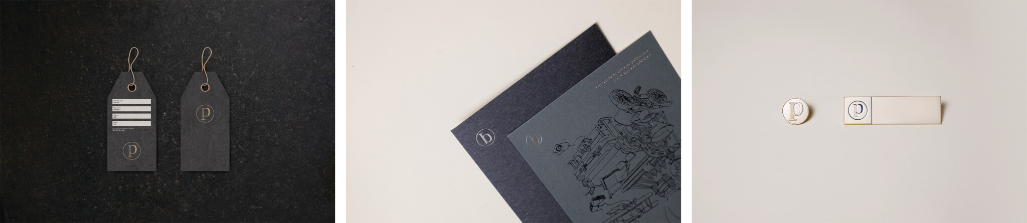
You designed and created the Page Hotels / Page Common brand. Can you please explain how you came up with the concept?
The Page Hotels and Page Common brand is really a labour of love and the result of great team work. In the initial stages of creating the brand, we sat down with the Butterfly Hospitality Group team to actively listen to their objectives and their plans to launch other Butterfly Hotel in Hong Kong and London. After rounds of discussions and brainstorming, we seized the opportunity to create a new premium, design and fresher brand. When it came to defining our reason for creating the brand (the brand pillars), who our target audience is (our urban explorers) and how we are bringing this to life, the brand concept came quite naturally. The name “Page” has such profound meaning and provides a perfect framework for us to create everything that followed; it represents a book, a chapter, a journal, a page of the story told by the urban explorer. Every idea is related to a page, starting with pen and paper. Applying it to myself, it is the first step to start every creative and design process.
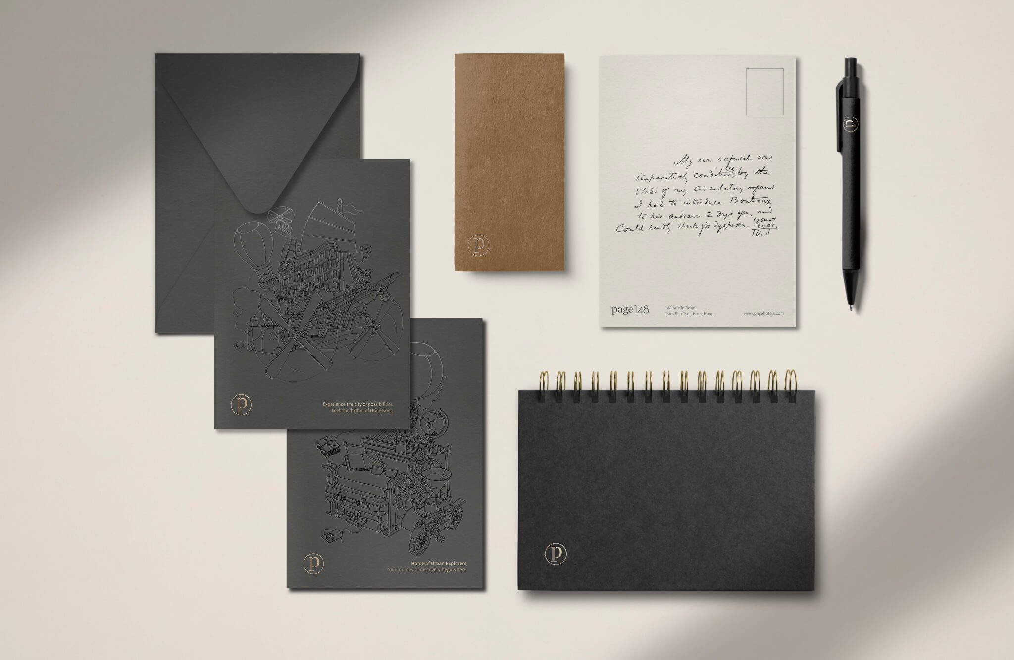
A page can represent a chapter within the adventurous narrative of the urban explorer that is co-created with Page Hotels through our Page Common journal. Visually, all the applications are infused with a dictionary concept in which the iconic logomark “P” is inspired by book spine and the wordmark “Page” is customized to convey a cultured, literary, novel-inspired feeling upon first glance.
On a personal note, I am someone who believes that like-minded individuals will gel instinctively. In this case, when I first collaborated on this project with Business Development Manager of Page Hotels Mr. Philip Chan to discuss the brand, there was an instant camaraderie amongst our design aesthetics (graphics, interior and architecture), love of coffee, and love of photography. To be honest, I put a lot of myself into the brand and design and that is why after we have defined the brand story and pillars, the design of the Page Hotels brand was created based on personal taste and lean towards an emotional approach, which is a bit unusual for me (to me, good design is a perfect balance between functionality and aesthetics, in other words, half logical and half emotional), I made a lot of design decisions based on emotions and gut-feeling in this case.
Can you tell us something we don’t know about the brand?
Many people may not know this but the logo design was completed in one-take, so what you see now is what I presented since day one. Normally, we would go through rounds of exploration and self-disruption before presenting the range of design options. For the Page Hotels branding design, we just went with our gut, and it’s one of those design moments where I felt so strong about it and I knew it was right from the get go.
Can you please explain to us the creative process of this brand and how you derived the design?
- How does the font design bring out the character of the brand?
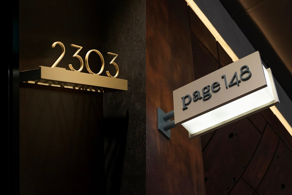
The wordmark “Page Hotels” is created with part Serif and part Sans-Serif. The rationale of using Serif, more accurately “Modern Serif” is because Serif has a natural look and feel of being from a literary novel. Crafting it with a modern Serif preserves the hint of classiness while giving it a contemporary look. The “ears” of “P” and “G”, the “foot” of “P”, the “link” and “loop” of the “G” are all crafted. The wordmark “Hotels”, “148” and “8” must be a Sans-Serif, to convey simplicity and modernity. My personal design style is about balance, a hint of class, and contemporary, which can be found in the character of the brand.
![]()
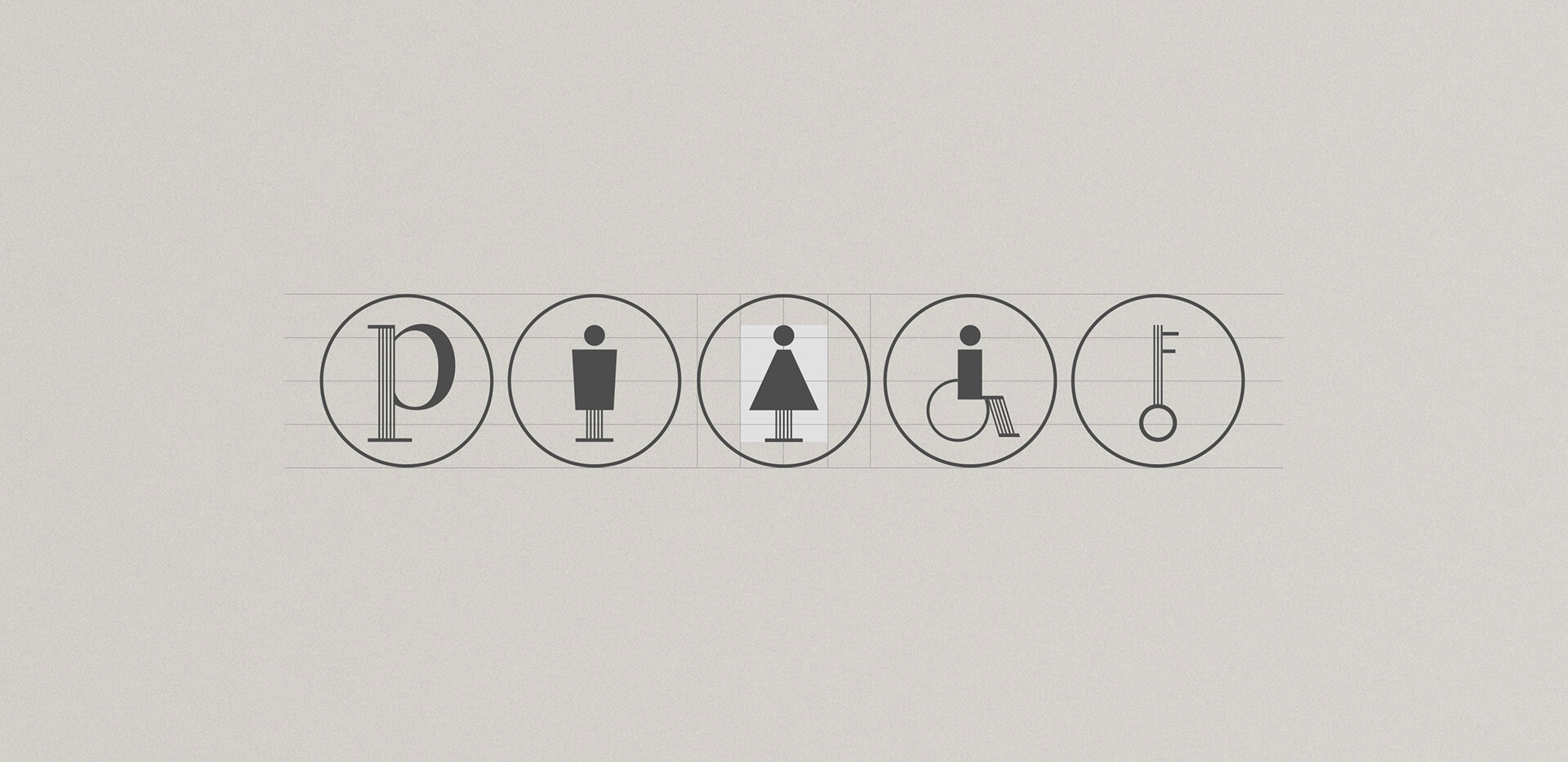
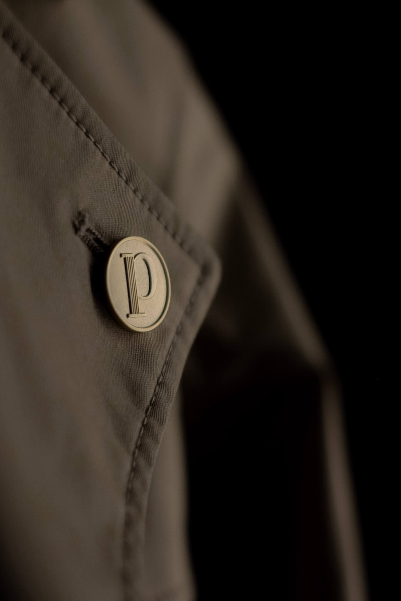
- Can you please explain more about the logo design?
To enhance the essence of Page, the logomark “P” is inspired by a book spine. We have also designed the icon set in the signage system based on the “P”, which reinforces the brand consistency, from print and digital to interior and architecture. Another personal design philosophy that I have really implemented into Page Hotels logo is to not over-do it, reduce to only the bare essentials with a simple touch that is just right.
- Can you please explain your choice of colour for the brand (Davy’s Gray, Beige Stone, Champagne Silver)?
The overall look and feel of Page is rather humble with a touch of class. With this in mind, we were instantly drawn to the Beige Stone palette, due to its warmness, subtlety and earthiness. The colour acts as a canvas for things that we put on the page, pun not intended! Davy’s Gray was chosen for legibility, as we did not want a shade that was too harsh and that completely contrasted with the Beige Stone colour. Finally, we added Champagne Silver to the mix to present a touch of class, which is usually applied for print finishing.
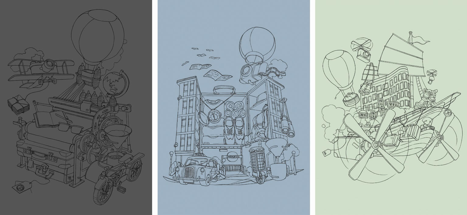
- Why are the hotel illustrations of Page148 and Page8 important in storytelling?
Though we wanted Page Hotels to be perceived as an understated classic brand, we also hope to inject an element of quirkiness into it. We benchmark ourselves against premium hotel brands and present an affordable luxury experience to guests, but we also want to be approachable enough to connect with the urban explorer. Hence, the idea of a playful illustration to represent each hotel was born. I believe that our urban explorers will resonate with these illustrations, each one capturing the unique elements of that hotel and the explorational spirit behind it. To me, “exploration” is fun and playful, and you will always encounter unexpected moments throughout your journey, so the detailed elements in the illustrations really showcase this.
- How much iteration was there before the final product? Can you share with us how the different iterations have evolved to the final version?
We presented 4 design directions, all inspired by the brand story and related to different target audiences: The ‘Young Spirit’ was a more playful expression on the brand with the concept of literally “flipping pages”; The second concept, ‘Neighbourhood’, has more of an urban feel to it and was inspired by the unique street signs of each city; For the ‘Cosmopolitan’ concept, we took a bold and confident approach, drawing inspiration from folded corners of a page. This design was then applied across all brand collaterals; ‘Explorer’ is the current design we have now that focused on the urban explorer narrative. Each of these concepts have a different link to the story, but expressed the brand in a totally different tone, look and feel.
How would you describe the design of Page Hotels?
As mentioned previously, I would describe the design of Page Hotels as humble and mellow with a touch of class because it is understated yet impactful, rather than being flat out flamboyant or over embellished. It is minimalistic and needs not to draw so much attention yet the textures and details add so much depth to the overall aesthetics of the brand. I’d also describe its design as being “considered” as all the design details are thought-through thoroughly, from the contrast of materials, colour palettes, down to a tiny stroke in the type and textural paper we used. To say the least, it is an amalgamation of mine and Page Hotels Business Development Manager Philip’s design style.
What are your most used design applications for branding?
In my line of work, on a day-to-basis, I will utilize the common design software like Adobe Photoshop, InDesign, and Illustration to carry out client projects. However, for design inspiration, Pinterest and Behance are really great platforms to keep updated on the latest design trends and see what others in the design community are doing at the moment.
What are your advice and inspiration for those who want to learn this trade?
One important word of advice I would give anyone looking to explore the field of design is to have passion in your craft, but also be able to take in criticism. Design is very subjective and it is easy to look at it with tunnel vision when you are in your own element working on the project, but team work comes into place when you look at it collectively. It is crucial to be open to constructive feedback because only then can you improve and refine not only the design itself, but your skills as well.
What does design mean to you? What does branding mean to you?
Simply put, it is my passion; a core element within me that constantly evolves who I am, my perceptions and views of the world around me. It also alters my perspective to appreciate the finer details in life and disciplines me to think logically in a functional aspect while I can still incorporate what I love and my passion into action. Through design, I am reminded every day to keep observing, keep learning, and keep exploring new things to get inspired.
It motivates me to constantly challenge myself and improve my craft and ideas.
From a branding perspective, I believe that branding and design goes hand-in-hand. It is a creative outlet for me to express my thoughts, visions and aesthetics onto paper. Branding is like running a restaurant where I see myself as the chef, given quality ingredients and finding a creative way to compose a delicious plate of art.
Design can be very subjective. Working with clients from across the sector, how important do you think it is to stick to your own artistic vision whilst adhering to your clients’ design needs?
For me, I really try to take in and listen to the client’s brief and get into their head to understand their perception of the brand so that both of our visions are aligned. I will take in what’s valuable from the client side and try my best to visualise it. In the initial steps of the project, we would explore a wide range of options for the client to gauge and see what it is they like and what is working. In the second round, we will narrow down the options to one that the client resonates with most and then refine the details. Essentially, it is a very collaborative process where the client’s needs are met without me having to completely sacrifice my artistic integrity.
My philosophy for design is that I refuse to stick to one template. Each design should start off fresh and be tailored to the brand’s personality and story which ultimately comes from the client. Hence, at the start of the project, we foster an open and communicative working relationship to allow ideas from both sides to flow.
What do you like most about your job?
The best part about being in my job, specifically in branding, is that every time I encounter a new project, it is like learning something completely new in a new industry. To prepare for each project, I dive into deep research and really try to understand the brand and how it works to get inspiration. In doing so, I am able to inject my findings and insights back into the design of the brand. It reinvigorates me each time I encounter a new project, and it also challenges me to be a better designer and open up my eyes to new discoveries.
Where can we find your design works?
You can find more of my work on my official website at www.fokfolio.com, but it is currently in the midst of being revamped so my Behance profile would be most updated at www.behance.com/fok.
Can you show us some of your best graphic design works
Of course, some of these works (shown below) are some of my proudest accomplishments to date:
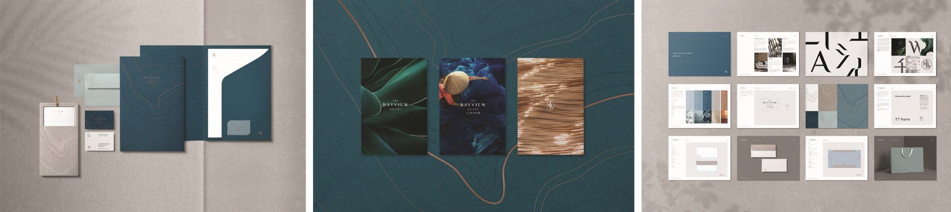
Bayview Project:
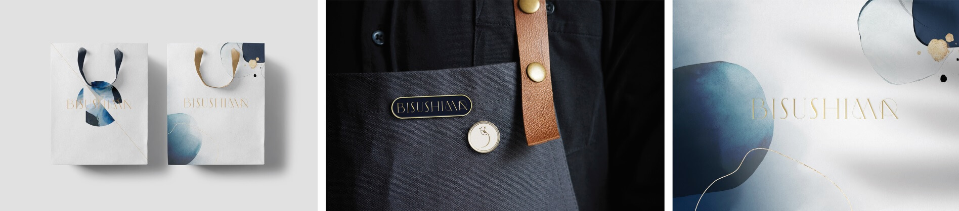
Bisushima Project:
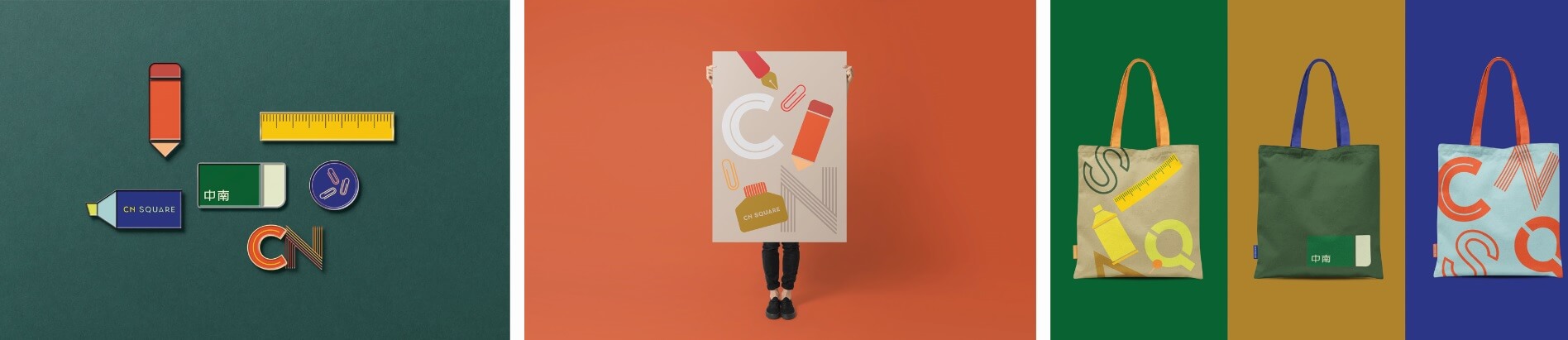
CN Square Project:
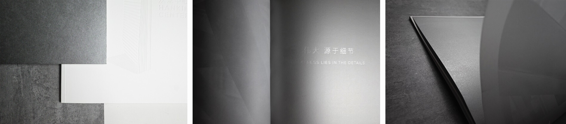
Hanking Project:
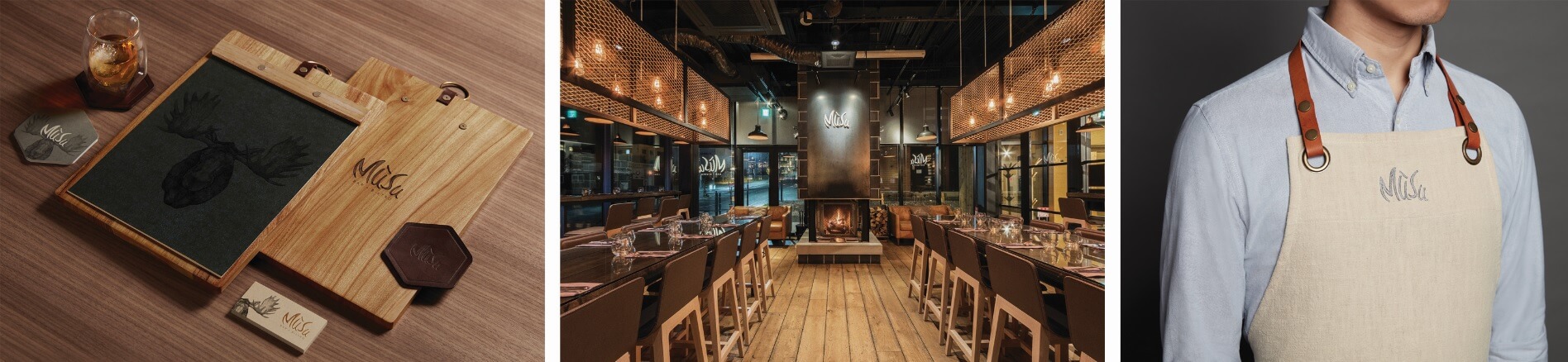
Mūsu Project:
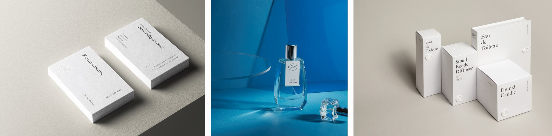
SWY – Scent With You Project:
What are you favourite design magazines – what would you put into our Page Common magazine collection?
I would definitely recommend Monocle and Magazine B to be a part of the Page Common magazine collection. For Monocle, it includes everything from travel and design to culture. It is everything you need as an urban explorer. I really like Magazine B because it dives deep into one brand at a time with lots of interesting stories and insights. Definitely a good read for anytime of the day!
Travel Inspiration
As a creative director, how often would you say you travel?
It really depends on the season but lately half of my traveling has been for work and the other half for leisure. With that said, I still try to make some time to explore some coffee shops whenever I am in a new city for work. When I travel for leisure, it is a time for me to unwind and disconnect from the world. I really enjoy photography and focusing on the subtle details so I’ll often take my camera with me when I am on holiday. I personally find such comfort in traveling every 2-3 months because, especially as a designer, it is important to see different parts of the world that I can take back with me when I return home and then feed it back into my designs. In a way, traveling is an outlet that fuels my passion and creativity.
So where does your inspiration for travel come from?
It may be a surprise to some people, but my travel inspiration comes from reading the Monocle magazine. I really love reading it because not only does it have a lot of information about design but the content – the culture, location and

What other destinations are on your bucket list?
I would love to go to Bolivia to visit the Uyuni Salt Flat in South America. It is this phenomenal mirror-like lake where the sky and land appear to intertwine and the wide open space stretches out for miles and miles. I have a fascination for architecture and minimalistic landscapes so going on a trip there would be incredible.
What do you enjoy most about the city? Are there certain elements or characteristics that are visibly Hong Kong?
Geographically, Hong Kong is quite a small city, yet it is the one place on earth that somehow incapsulates all the international elements in one place – from the food to the culture. Hong Kong is a melting pot of all these rich cultures that are in such close proximity with one another. What I love the most about the city is its efficiency and convenience. Growing up in Toronto, you can only do two things a day; whereas in Hong Kong, you can do like five things a day because of the great urban planning that allows for you to manoeuvre around the city easily. I can be having breakfast in Central, and then be on a hiking trail in 30 minutes; that is how convenient it is to get around Hong Kong.
If you can choose one place in the city that embodies the essence of Hong Kong, where would it be and why?
I would have to say Central and Sheung Wan districts because there is such a cosmopolitan feel of Hong Kong where I can look up at the sky in Central and be surrounded by all the tall skyscrapers and corporate buildings. This never ceases to amaze me even having lived here for so many years. Just walking a few minutes towards Sheung Wan, I can find a myriad of authentic boutiques, restaurants and street stalls filled with such history and culture of the city. Simply looking at these two opposing examples, it is interesting to see how the east meets west culture, as well as the old and the new can co-exist harmoniously together in one place.
In 3 words, how would you describe Hong Kong?
Adaptable, Efficient and Condense